Sunday 30 January 2011

The many (weird) faces of Curt Swan's Superman

If you know me at all, you know I like my superhero comics old and boring. As in Wayne Boring, Kurt Schaffenberger or, best of all, Curt Swan. Thanks to those Blue Ribbon cheapo reprints of old DC comics that were around in the 1970s, these guys defined Superman for me, as he should be: lantern-jawed, broad-chested and incapable of expressing human emotion.

There was something about the 1950s-era Superman of Swan that was almost right. Just-about-perfect, yet somehow charmingly stilted. So imagine how pleased I was as I was flipping through this behemoth of a book called DC Comics Year by Year: A Visual Chronicle and came a cross this wonderfully odd two-page spread of what looks to be character studies (or maybe an artists' guide?) of Kal-El by Mister Curt Swan himself:      


What a great find, right? More than two dozen head shots of Supes in various states of awkwrad emotional distress. But, like any good 1950s Superman artist, some of the emotions are hard to parse.

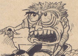
Take this one for instance:


Is the Last Son of Krypton shocked here? Surprised? Without a story or word balloons, the mind struggles to pin it down, right?

Then there's this pair:


Is that a knowing jovial wink, or something more -- ewww -- flirty? GROSS! And what's he doing on the right?? I odn;t even want to think about what's happening off frame....

But my fave head shots of the bunch has to be this trio:


I know that first look! That's the unmistakable look of someone who's just eaten at a Taco Bell, Number Two could be a whole host of things, but it looks to me like the Man of Steel's heart is getting just a little crushed (Jimmy Olsen probably got a real job in a better city). Then there's that last one, which is probably supposed to be Supes soaking up the life-giving rays of Earth's yellow sun. Yes.

Er.....


Best not to ponder this one too much. I imagine Swan didn't, so you shouldn't either.

What was my point again? Yes, Curt Swan is the Greatest Superman Artist Of All Time, Period; in part because his art was just slightly off. He was 90 percent there most of the time, but there were plenty of times that Big Blue just looked kind of odd. Which is a better batting percentage of most artists these days, who seem to have two or three standard expressions. Maybe this was intentional! Perhaps Swan figured that Superman was an alien, and would therefore never be fully at ease with humans. Thus, the weird expressions. (It coulda happened!) 

Whoever your favourite Superman artist is you owe it to yourself to give this book a look. It takes 75 years of DC Comics history and spends a few pages on each exploring the important characters, events and creators that marked that particular period. (It starts with New Fun #1 in February 1935.) As it suggests in the intro, flip to the year you were 13 and read those pages first -- since this is supposedly the age that most kids get into superheroes.

It's a hell of a lot of fun -- and worth a look.    


Wednesday 26 January 2011

David Collier covers The New Yorker

Never let anyone say David Collier isn't up for a challenge.

Apparently cheesed-off at criticism that his cover design for his just-released graphic novel Chimo was lacking, the great Hamilton cartoonist worked up his own cover design for The New Yorker and submitted it to the magazine's 2011 Eustace Tilley contest. I have to say, I'm pretty impressed:

 
The design is great, the art is controlled and precise, and the details (like the puck replacing the butterfly) really make it sing. The whole thing seems fitting for the subject matter; the Rangers (who have a reputation for being an over-priced, under-performing team) would naturally have a fop like Tilley on their team, plus it allows Collier to draw something that manages to have one foot in  Canada and the U.S. The only thing I can't figure out is who the coach in the background is supposed to be:


Dave provides a bit of commentary about his unique take on the iconic Rea Irvin character on The New Yorker website.

Tuesday 25 January 2011

Justin Green has a blog??

Hey -- Justin Green has a blog! The man behind the pioneering psycho-confessional comic Binky Brown Meets the Virgin Mary and The Sign Game (one of my favourite comics of all time) unveiled a blog a couple of weeks ago. And while he's yet to write anything he has posted what appear to be new strips, which, let's face it, kind of speak for themselves.


 What are you waiting for? Go check it out already!

Saturday 22 January 2011

Reluctant stars of the comix universe

The Books section in today's Globe and Mail includes three reviews I wrote about new works from Seth, Chris Ware and Julie Doucet. You can find it here.

I had strong feelings about all of these books, but I was most conflicted about Doucet's latest. Like the die-hard fans I mention in the lead, I snap up anything she produces, and I'm always ashamed at myself for being a little disappointed with the results. Her art is great -- no doubt about that -- but her decade-plus abstention from comics makes her work hard to assess.


It's as if she gets as close to making comics as possible, without actually making comics, and the result always seems to suffer somehow. I respect her decision to part part artistically with comics in favour of other creative pursuits, but why put out a book titled My New New York Diary (a spin on her best-selling graphic novel, My New York Diary) if you aren't prepared to engage with comics or cartooning in some way? Even if you're unwilling to make actual comics, why can't you discuss that break with comics -- and your choice to make an illustrated book?

The end result of her creative reluctance is a book that feels half-hearted; which is something I never thought I'd say about Doucet, one of the most fearless artists of her day.


Thursday 20 January 2011

Art Spiegelman rewind

This is a pretty great find. Recently Montreal cartoonist Rick Trembles was combing through a stack of old CARtoons magazines he nabbed from a flea market and spotted a winning submission to an art contest from an "Art Spiegelman" from "Rego Park, New York."


For the uninitiated, CARtoons was (is?) an "automotive humour" magazine dedicated to car culture and goofy cartoons about said car culture. Like many kids, I read it compulsively from age 13 to 16.  

According to Trembles, the issue in question is from November 1963, which, if this is the same Spiegelman (Maus, Raw), would have placed him at 15-years-old --- the perfect target market for CARtoons. I'm not in a position to confirm or deny this, but if it's true this is a great curiousity from the early career of a master cartoonist -- and a stellar score by Trembles. That's a detail from the image below; click here for a full view.